Friday 17 April 2015

28 // Completing the Character Designs and Turnarounds

So this is the last thing I had left to complete for this project; the turnarounds.

Not much to say here, they'd more or less made themselves along the way, from early development to final illustration. There were still some areas of each design left to be figured out, but overall it was fairly straightforward.

It could be said that I should really have completed these before producing the illustrations, but I'd argue that the illustrations were never intended to be each character's final appearance, merely a stepping stone towards the final product. Also, drawing the characters up in illustration format first gave me the opportunity to see what was or wasn't working, and adapt the design to suit.

The project was a fun experience, with highs, lows, new and old techniques alike, and plenty of fun.

Here's hoping the designs are - despite being quite unoriginal - successful in what I set out to portray.


27 // Completing the Spellsword Illustration

After having flown through the Warlock illustration with relative ease, I set about finishing off the Spellsword girl's design. 

My first task was to decide on the colours throughout her design. Working straight into the linework for her illustration, I laid down flats in an experimental manner, trying to stumble upon the winning combo. Just about every colour combination I could think of was used in this stage (in hindsight, I should really have saved all of the variations, but I was so exhausted at the time that the thought didn't even cross my mind... having a 6-month old kid means working through the night and being absolutely shattered all day becomes commonplace, as does a semi-functional mind!).

It was actually her demonic hand that gave me the idea for her final colours; the hand kept reminding me of a gargoyle, which in turn made me think of grey demons, which led to desaturated blue and greys throughout her outfit and sword, and grey-blue hair. It took a while to get there, but it was definitely the best of a bad bunch.

With the flats worked out, I had a think about what style I would use for this illustration.

Having used cel-shading for the Warlock - and loved the process - I thought it would be a good opportunity to use a slightly altered technique for this girl. I thought of ways in which I could combine the techniques I had learnt from cels with my own personal illustration style. I applied the overall technique here and fairly enjoyed it - both the process and result.


Unlike the Warlock illustration, I hadn't planned this one very well at all, and boy was it a struggle at times!! All I knew about her was what I had in front of me... that she was sitting somewhere with a severed head in her hand. Just having this to go on kind of limited my options!

I sketched out several possible environments and moods as quickly as possible, hoping that some plausible idea would leap out at me. It took a while for me to get anything. I stretched the canvas in all directions, playing around with flow lines, focal points etc without really getting anywhere. Taking a break from it, I eventually started to try and make sense of the messy scribbles.

Shapes have a funny habit of popping out when you least expect them, and soon I was seeing cliffs and spires. I had nothing else to go on. With deadlines getting closer I figured I had to bite the bullet and just go with gut instinct. I defined the shapes I had seen, and stuck a rock under her ass, because it made a little bit of sense.

The rest of the process is a bit of a blur; by this point I was having to work all through the night while the kid slept (as she requires so much attention during the daytime that it's near-impossible to get this kind of work done) then score a couple of hours sleep on the couch in the morning, wake up and get through the day before doing the same thing again. However, sleep deprivation has it's benefits; you can sometimes get nice ideas from out of nowhere. On the other hand, your brain is more likely to refuse to function when you really need it to... which happened quite frequently here.

Anyhoos, I played with a ton of ideas during the time it took me to figure out that she was sitting next to a small bay. I didn't have too many guidelines to help me create flow around the image, so I tried to give the illustration an underlying narrative that would both enforce her evil, ruthless nature and also guide the viewer around the illustration.

I was making stuff up on the spot, throwing ideas all over the place before I finally resigned to the fact that most of them were a bit crap, so I just kept the ones that weren't completely ridiculous. I have no idea if the narrative aspect works for this piece or not... I spent so much time working on it that it no longer makes much sense when I look at it! That and I've never really tried narrative-driven-compositions before, so it's all a bit new to me. But fun, nonetheless.

When it came to colouring the BG, I knew from when I coloured the girl that I wanted the light source to be top-right. I'd been working through quite a few sunrises during this time, so that's where the idea for that came from; a nice, mellow morning setting. It sets quite an interesting atmosphere, as if the battle took place during the night and now as the sun has risen, there's calm across the bay. Similar to the Warlock illustration, it's unusual to see an evil character in a bright-ish scene.

So that's about it the gist of it for this illustration. There was a lot of juggling around towards the end of it, and there are still a lot of things I'm not happy with or would change, but time was running out for me and I had to move on.

This is the final illustration...


26 // Completing the Warlock Illustration

I forgot to mention in the previous post that the design for his staff-head was influenced by a decorative design I saw on a gate while taking a break from this piece; it caught my eye as I was out wandering with my dog, thinking about how I could use the sunlight to my advantage in the composition - the design has sunrise written all over it, so I thought it might add a nice extra element to the character design, maybe providing some sort of backstory.

Also on my wanderings, I'd decided upon the colour palette for the character: having been looking at some images of Playstation Home's Mos Eisley Cantina location, I'd been attracted to the brown/blue colour combo. I've used it before in other projects and it's definitely a favourite of mine. I think it fits the character well, as the different shades of brown robes scream hobo. Or jakey.

The blue was destined to be applied to the spell he's in the midst of casting - the two colours together add to the strange scene I'm trying to portray: an evil character in an unusually bright setting. 

One of my predetermined goals for this project was that I would try out a few different art-styles throughout my work. I'd already tried out several different sketching styles along the way, and now I was ready to try my hand at a finished piece using cel-shading - a style I haven't really touched for a couple of years.

I did a fair bit of research into how cel-shading can benefit an illustration; most notably is in cases where the lighting is quite extreme, and high-contrast is likely to occur. I figured that this piece fit the bill fairly well. Also, the jaggy shadows and edges that would be produced by the torn robes would definitely benefit from the hard edged shading, hopefully reiterating the point that this is a dangerous character (Kekai Kotaki's Evil Character Design 101: spikes, spikes and more spikes)

So I gave myself a crash-course in the basics of the technique and set to work. I discovered that careful planning and organisation will assist the entire process immeasurably, from start to finish. Layer and mask management will also allow for swift modifications to be made wherever necessary during the process. This is good to know, as you can get some very nice colour blends from the technique if you're careful and use non-destructive editing throughout the colouring stages. Having access to quick and easy colour shifts at the end of a project is always a bonus that can lead to real happy endings.


I'd been following a couple of different tutorials regarding cel-shading to begin with, just to get a feel for it, but soon found myself integrating some of my own techniques into the workflow to try and mix it up a bit. It took quite a few hours to get the entire shadow mask drawn out, but by the time it came to the end stages of colour editing, it was all worth it. The example below shows my final result on the character, which I'm pretty chuffed with.

I also decided upon the BG being based around a very desaturated light brown, to assist in the blue spell popping out from the page.


In accordance with the change in perspective from my original planning sketches, I sketched out the new BG, using a desert-type landscape with some jutting rocks for visual interest. I kept to my original plan of letting the flowing robes and clouds steer the viewer's eye around. At this point I had the idea of his power generating the wind around him, thus causing the flow. I used the clouds to create a kind of vortex around him and implemented a sort of fish-eye perspective on the vertical axis to make the composition more interesting.

I'm not entirely convinced that this worked out terribly well - the whole process altered the composition quite drastically and may have resulted in me taking it in the wrong direction, but what's done is done.

The last adjustment I made was to add a desaturated blue gradient across the sky (originally it was a lighter brown, as if within a sandstorm). The blue worked tons better for the image, unifying the palette and providing a backdrop from which the character could really pop.

So here's the final illustration...


25 // Beginning the Warlock Illustration

Since I seemed to be on a roll with this character, I moved straight onto the illustration process.

I started off with four composition variations; super-rough value sketches; no more than ten minutes each.


After picking my favourite, I tried out some lighting variations; again, super-rough; ten minutes each. In this case, my favourite was the backlit, rim-lighting style.

During this stage, I decided that I didn't want him to be holding a book in his hand. Instead, I wanted him to be caught in the middle of casting some kind of a spell that would be glowing fiercely and creating a secondary light source which would light the dark side of his face from beneath in a creepy kind of way.

I had originally planned for this illustration to be a nighttime scene, but at some point along this stage I decided to set it in a daytime, high contrast environment (I had an idea that the warm, daytime tones would provide more interest than cold and dark (also, to place an evil character in a sunny daytime setting tends to give a piece quite a strange atmosphere - it almost doesn't feel right)).

As the sketches show, I was thinking of how flow could play a role in the composition, with the clouds and robes all playing a vital role in steering the viewer's eye around the piece. I'd already established that there might be mountainous - or rough - terrain surrounding the character, so the image was gradually beginning to form in my head as I progressed.


I gathered my reference for the pose and set to work. The pose I worked with differs slightly from the original sketches, as I settled for a lower vantage point, to try and emphasise the power of this character.Working with thirds, I positioned the pose and started figuring out all the details, working and re-working different elements until I was happy enough to get on with linework.

This piece was coming together far more efficiently than the Spellsword already, mainly due to the lucky start, and some careful planning earlier.


24 // Early Development 04 - Warlock

Moving on from the Spellsword girl, it was time to give the Warllock character some love. In my first set of exploratory personality sketches, I'd tried out various age and personality options. The one which really appealed to me was that of the goatee'd bald guy, as he had an air of evil about him.

Ryan gave some real good feedback at that point, mentioning that as a character designer, it's important to consider the popular character archetypes, while considering ways that their notable elements can be mixed, matched and altered in ways to create new, but recognisable designs. I tried to heed this advice as much as possible when moving through these stages, but will say now that I think I failed completely in coming up with anything original :(

In this first image, the sketch in the bottom right is something I'd been imagining for a while (based off of the early goatee man) and managed to rattle out in twenty minutes or so. It's very close to what I had imagined; a psychotic-looking, pissed off, dangerous old man with a crazy, wiry beard and hard leather armour over the shoulders of his robes. It's not often I can pull a sketch out of my head so efficiently, so I was fairly pleased with how this was going already.

I can remember thinking that I had found my character with that sketch. The face and expression was as I wanted it, and the beard was crazy-wizard-looking enough that it would likely do just fine. I tested out a few alternative hair/beard designs to make sure I wasn't jumping the gun. A couple of these designs were from reference, the majority from mind. By the end of my tests, the original was still winning, despite it's unoriginality.

Even though I liked the simple look of the first leather armour layers in the sketch, I thought it best to try a couple of variations on that too. I tried adding more layers and details in places, but I had in mind a story for this character; a world-weary Warlock whose powers are so immense that he has no real need for lavish, decorative armour. I imagined him to be a bit of a hobo-looking guy, whose hidden powers and psychotic nature would make him a dangerous character despite his lack of stature-defining garments. He'd be someone who travelled the world, kicking ass all over the place, searching for greater powers.


It was going pretty smoothly so far with this guy, so I moved swiftly on and started testing out some lower outfit ideas.

Layers of leather and robes were the main elements I wanted to carry through the design, so I tried out different material ideas; furs; decorative drapes; buckles; armoured or worn leather boots; thick stitching; trousers etc. It was the third iteration that stayed most true to his already fairly established hobo style; torn robes and worn boots with a fur belt and big evil-looking buckle design

Even though this kind of look has probably been used on wizard characters a hundred-thousand times, it just felt right with this guy. I wasn't doing anything super-original, but I'd try my best to do it well.


23 // Beginning the Spellsword Illustration

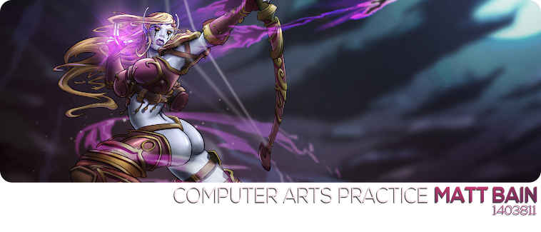
I was desperate to get back to working out the Spellsword character design, after my failed experiment, so started to think about what I could do for her final illustration.

I'd already settled on keeping her looking quite sexy, with a fantasy-styled armour set and magical weaponry. I then started to think about how I could convey her darker side. Referring to the earlier development sketches, I thought again about giving her some deformations. At the same time as this, I was also thinking about what the illustration might portray; I had found a nice reference photo of a sitting pose that I could sketch from, with slight adjustments to the posture to make it more interesting, so I started scribbling away.

After a while of trying to figure out what I could do to make the pose my own, I had the illustration's story building in my mind: she's a strong, fearless warrior mage who's just beaten a challenger. Being a cold-hearted, ruthless killer, she's torn the man's head from his shoulders and now holds it out for the viewer to see, daring them to think of challenging her.

I guessed that this might get the point across about her being a darker style of character, so began to play around with a few more ideas; maybe the hand holding the head was in some way deformed, like a demonic hand, granting her super-strength. It seemed too close an idea to the likes of Witchblade, but I liked it nonetheless. Also, for illustration purposes, given the pose and how the hand wouldn't be entirely visible, to hint at it's alternative state might make a nice visual point.

I rode with that idea and altered the position of her left hand, adding to it a sword that I planned to make look fairly bad-ass later on.


I took a day out from the sketch and returned to it to find a few mistakes in need of correction - mostly with the head area. Other than that, the anatomy seemed solid enough.

I used to be quite bad for not taking to the time to fix all mistakes that I spotted - I would just move on and try to wrestle a piece of work into submission. I don't work that way anymore, I take time out at each stage of a project and fix any mistakes as they appear to me. I also seek feedback from peers as often as possible, just to double-check (peer groups that I use regularly are on Facebook, but from having used the Behance WIP feature so often this term, I'll be seeking feedback from class peers too).

I hadn't thought too much about the overall composition of the illustration up until this point - something that would come back to haunt me - but knew that I wanted her to be situated on the left side of the illustration, pointing to the right. For this reason, the original flow of her hair had been heading in the wrong direction, so that was adjusted. While I was doing so, I referred to my earlier hairstyle sketches, playing around with several variations of the long, side-hanging fringe, to see if I could make it work in my favour.

There were a lot of scribbles and discarded sketches for this stage but upon reaching this point, I was pretty happy with my choices so decided to move on.


This is probably my favourite stage of character illustration - dressing them up and getting everything in the right place. It can be very time-consuming, especially as my OCD kicks in and I have to get all the clothing in the right places, and following the correct curvature etc. 

Since I hadn't fully decided on the girl's outfit, I had room to play around a little. I feel like this was a double-edged sword; on the one hand, I had plenty of sketches and ideas to refer to, so a good portion of it was practically figured out already; on the other, I would be filling in the blanks with features that would benefit the composition of the illustration, but might not necessarily work in an actual design sense. I decided to wing it and see what happened.

The torso armour design came straight from my earlier sketches - albeit with slight alterations - while the leg pieces and belt area took quite a few revisions to get the way I wanted them. Plenty of sketching, erasing and re-sketching went into this before I eventually had designs that worked for me. I used as little reference as possible for this, relying on visual memory for 90% of the process.

Once I was happy, I knuckled down and got stuck into the linework. I'm always striving to evolve my skills in lineart, so I take my time to get lineweights and tapers just right, and try to produce smooth lines wherever possible.

I was happy with the end result, so worked on the sword a little (the whole time I'd been working on lineart I'd been thinking about how it might look) and luckily, got a solid Bastard sword design in just a couple of tries. I inked it up and called this stage done for the meantime, posting it online to seek feedback.


22 // Tangents

These images show a slight tangent I went off on, following the Spellsword costume sketches. I was wondering if it might be possible to get some retro-futurism designs into the process, so as to assist the 80's influence.

Heading into C4D, I dabbled with a few ideas - mostly voxel - to see if anything might help me to come up with some ideas, either for costume design, or environments. I made these. Nothing happened. I didn't do it again.